Tuesday, 30 October 2012

Week 14

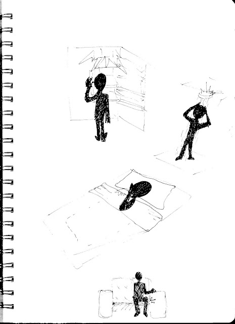
So we've had our last normal class but today we had a special workshop with Yasu and Leonardo to help us all build our working models. This was a really great resource for all the groups. Not only were they able to supply us with basic bits and pieces of equipment that we might require but they were also really helpful in giving s direction for the arduino part of the project. I think a lot of groups got significant benefit out of this, and many of us would have been lost without this final workshop.

While all this help was available to us, our group has made the decision to attempt to programme as much as we can without assistance. In doing this, our model will be quite simple as to work within the teams basic abilities. We think this is a better way to go about it,  rather than designing a complex circuit with lots of different outputs and inputs and getting Yasu to basically do it all for us. We think our decision will be beneficial to our project and hopefully the markers at the end will appreciate his more.

Today of course we did some help. Leonardo helped simplfy our concept for our working model. From this we cut our plan to use lights. After thinking about it, they were kind of pointless. We had the vibrators to use and so the light and vibrators would be going off at the same time, which really was not a necessary part of our design. From the chat with leo we were able to make a much more easily understood plan of our circuit. We came up with a way to effectively communicate the workings and purpose of our electrical components. 


We will have three push buttons that are each connected to one motor with in each "ball". There will be three motors in each part which have different intensities. Pressing two or three buttons at once will trigger each motor connected. 


This working model we hope will communicate to the class how the two balls are connected. So if one ball moves then the other ball will move. It doesn't work exactly how our design does however i think it expresses the design intent quite clearly. 

Wednesday, 24 October 2012

Story Board

These story boards show the object, behaviour and scenario step by step. It is however not an effective way of telling the narrative and expressing the emotional experience, which is why we will be doing a video for that. 
To assist in communicating this sequence I will use 2 persona's; Mandy and Emma. 


1. The very first step to the process is a cause. The users firstly need a reason in which to purchase and have a need for our product. 
Mandy is moving out of the share-house she has been living in for the past 4 years with her best friend Emma. Mandy has just graduated and landed her dream job in Sydney. It is very sad for both of the girls to have Mandy move away.

2. Emotions trigger the initial decision to use the product.
Emma feels lonely living in the house without her best friend. She fondly remembers all the great times they used to have. They used to see each other everyday and never got sick of each other. They loved to watch scary movies together on Friday nights, playing in the same netball team and inviting all the girls over for dinner and drinks.

3. An agreement is made to use the product together.
After Mandy's great suggestion to get an InterBall, they both jump onto the Internet and order their products.

4. Within the week both girls have their InterBall's delivered!


5. The girls unpack their new gadget

6. Both users get back onto the website

7. The serial number which they received with their product is entered into the computer system

8. The girls connect their products and sync them. They are now ready to use!


For the Fridge attachment device.

9. The product is simply attached to the fridge door using the suction cap.
10. Emma is having some of the girls over for a small party. This is her first time entertaining by herself without Mandy. She is struggling a bit doing it alone and is not enjoying it as much as she used to with Mandy. Emma struggles to the fridge with her hands full of food and drinks. It was times like this she really needed Mandy around. the two of them in the kitchen used to be great, they were so in-sync with each other. Emma has difficulties getting the door open with Mandy to hold it for her. Then she realises her new InterBall is there. She gives the product a casual kick with her foot and the fridge door opens for her. Emma is very relieved and laughs at the thought of if Mandy had seen her struggle so much.

Over in Sydney Mandy is eating dinner alone. She suddenly sees her InterBall on the fridge light up and begin to hum. She jumps in surprise and then begins to laugh as she imagines poor Mandy trying to entertain all the girls by herself. She feels a little home sick wishing she could be there to help her friend out and enjoy the celebrations. But she loves it when her InterBall is activated when she int expecting it. It gives her a warm feeling, as if for a moment she was with her best friend. It gives her some assurance to be able to know occasionally what Mandy is up to.


 11. The day after the party Emma has a big sleep in and finally wakes up at midday to go and watch some tv. She spreads out on the lounge and unconsciously reaches for the ball sitting on the coffee table and begins to play with it.

Mandy's face lights up as her InterBall begins to move around the carpet widely on it's own accord. She watches as it speeds up and all of a sudden stops, then goes crazy and slows down. Mandy gets such a thrill out of this. She loves being able to see when her friend is playing. Mandy kicks her InterBall a little way. Emma, on the other end gets a shock as her Interball begins to hum and vibrate in her hands. The two friends have a great time playing together and influencing how each other interBalls react.


12. There are future instalment which can be purchased by users. A gradual network of products can be accumulated through time to build up a community of interconnecting, interactive products. The product line is highly complimentary and building the network will enhance the user experience.

Tuesday, 23 October 2012

Week 13

This week was our last week to be able to talk to all the tutors in a normal tutorial format. I think we had made some good progress since last week. I had done up a good chunk of the storyboard and Georgina had modelled up on the ball on solid works. It was good that we had these things done so we could get some feedback on them, but we are also able to use them for the final presentation so its good to get them done early so that we have less things to worry about closer to the due date.

First off we had a quick chat with Leonardo. We didn't have much to discuss with him  so he left us so we could continue working.

We worked on planning the internal components of the product. The required components are;
Motor
Battery
Off centred weight
LED's

For the lights, Brenden suggested using fibre-optics which I think is a good idea. It's very helpful for our team that Brenden knows a fair bit about this stuff so he can see all the ideas realistically and help us all understand how things work. We managed to spatially plan all the internals to fit within the product (15mm diameter).

After this we went through the planning of each; product, behaviour and scenario, and how we would be communicating these in the final presentation.
Product- Form model, solid works model, technical drawings, BOM
Behaviour-
Scenario-
Here was were I started to get a bit confused. I was having difficulties in separating behaviour and scenario. and i wasn't sure which one my storyboard was communicating. So we went and talked to Marienella and Leonardo. Marienella made things much clearer. They can be communicated in the same format or separately. One of them (now I can't even remember which! scenario or behaviour??) is a step by step process of how the product works. Every single action that must take place in order for it to do what it is meant to do. Where as the other one, (scenario?) is more about the user. Why the product is  important to the user and what impact does it have or what experience it offers. So we have decided to show this one through video. I think this will communicate it much more effectively than images and will be able to capture the experience more.


Sunday, 21 October 2012

Summary


This word bank was put together on the internet using the url of this blog. I think it is a great overall idea of how the project has been progressing and shows all of the different things we have been thinking about along the way. It gives a quite broad indication of our scenario, behaviour and object. 

Wednesday, 17 October 2012

Interactions With Balls


It is interesting to look at the different interactions people have with balls. Each one plays plays a certain role, even if that is to be flexible and adaptable to different styles of usage. Different functions that balls can have are;
-to relive stress  through squeezing and applying pressure
- Specific sports equipment eg. balls to bounce, be hit and to kick

Shapes and materials play a very important part in the functionality of a ball and also work to add a sense of intuitivness.

Ways in which balls can be interated with:
  • squeezed
  • kicked
  • thrown
  • bounced
  • caught
  • spun
  • tapped
  • pressed
  • dribbled
  • shoot

Tuesday, 16 October 2012

Behaviour, Scenario and Object

At the start of the class we had addressed scenario and behaviour. By the end we had a good idea of our object as well! This was the first time through this project that we were actually thinking about a physical product which was good- we're getting some where!


The above diagram is how the scenario works for my team's project.


Week 12


Today we had a look at what we had all done for our 4 concepts. We all agreed that it was very challenging coming up with them. I think we just picked a hard concept to go with. But I think at this stage we need to move on with the concept and start thinking about the more detailed aspects of the project. So even if we don't completely nail the concept part but can do a good job on the technical drawings and presentation then that would be good.


After sharing our concepts amongst the team we all agreed that Brenden's 4 concepts had the most direction and had great linkage between the four products- which no one else's really had.

We spoke to Yasu about it and got some great feedback. He seemed to be quite happy with our progress and suggested instead of trying to design 4 separate products as part of a line, we focus on just two products in depth. This way we can make the designs more thought out and detailed and then just say that they are a part of a family, and more products can be bought and added to the network.

These 2 concepts are the ones we have chosen to move on with and develop further.


This week we spoke with Yasu straight away very early into the tutorial. This was very beneficial for us as we got input to work with straight away rather than waiting around. We decided that after this very valuable talk we would just work from that. In previous weeks we have been getting mixed messages from different people and so getting confused and often going off on the wrong track. So next week we will try and talk to more tutors, but this week i feel like it was a good thing for us to only speak with Yasu.

During the meeting we skyped with Bek as she was sick and unable to come to class. I think this was an effective way of catching her up to our progress. She was able to see drawings to understand what we were talking about and I think different people explaining the concept helps us understand it better. And also to realise effect ways of pitching ideas to make them look good.

We spent the time figuring out some of the "object" related issues. Such as materials and manufacturing. We're still at a very basic stage for this but at least we've started thinking about it. 


What we as a team worked out to be the steps involved in the process 

We were able to as a team delegate different tasks to each member which will give us a good start on moving forward and hopefully allow us to have more progress to show for the next week.


Me: story boarding and narrative
Bek: Design brief
Georgina: Start solid working up one of the products
Brenden: Start working on the other product model, and email Yasu our plan for our working model

Once we have a solid works model done for each we can use the 3d printer to get our object model. This I think is the most effect way to do it. It is basically killing two birds with one stone, we have to do solid works models, so we may as well us these models to create our real life form model.


Monday, 15 October 2012

4 Product Concepts and Prototypes

Separately have gone away to come up with 4 concepts each for individual products. 2 for the lounge room and 2 for the kitchen. These are the two spaces which we worked out to be the most commonly used spaces between housemates. Due to the interaction, routine, and occurrences in these spaces there is the most opportunity for experiences and memories in which we can aim to recreate. 


The goal of each of our concepts is to find a way in which to allow ex-housemates to be reminded or revisit certain aspects of experiences that they once shared. 


I must say i found this process very difficult. Coming up with 4 concepts was very challenging, and I found it hard to know when I was heading off track or missing the point. And we have been tweaking our main overarching concept for a while know, so I had to keep in mind that the idea of coincidence and swarm were both no longer relevant. 


CONCEPT 1. 

The first one is an attachment to work with any fridge within a home. The soft padded piece is stuck onto the inside/back of the fridge handle, by its adhesive surface. Inside the piece is a pressure sensor which feels when someone is constantly opening and closing the door or when they are standing there with the door open for a period of time. The product relies a bit on coincidence. If the other person happens to open their fridge door at the same time, their product will generate warmth onto the surface of the product that is on contact with the hand. This indicates to the person that the other person is also at the fridge and has been there for a while. This concept aims to bring back a particular fondness of the person like their indecisiveness, constantly looking for something to eat, never pleased with whats there or just going to the kitchen due to boredom. 
The rough prototype found that the shape and cushioning material was comfortable to use. The form was unobtrusive and fit easily under the hand. The problem with the shape though is that it is not a universal design in that it does not fit with narrower fridge handles. 


CONCEPT 2.

The next one is based around the occurrence of entertaining and socialising. The product is designed to be an ornamental centre piece of the table. It is a kind of plate or cutting board that communicates between houses. When one person is having people round it is translated through the device over to the other person's. When cheese is being sliced, the surface underneath it recognises either the pressure or the movement or proximity of the hands and signifies its usage by lighting up the other device through a gentle glowing. 
The prototype for this one was extremely simple. Perhaps to simple to get enough relevant feedback from testing and trialling. The dimensions of the prototype are very poorly thought out. Would have to be made wider in length and lower to the table. 


CONCEPT 3.  

The third concept is only really relevant to those who have a habit of constantly flicking through channels the ads on TV. A special remote encourages this behaviour. After a certain amount of time of one person keeping on flicking through it alerts the other user. By any means such as, flicking the channels on the other TV, beeping or some kind of noise or vibration or humming.  
The paper model was too geometric and bulky for trial users to handle in a natural way. The one button makes it easy to use. The button would be best extruded or indented into the casing with a textural surface to enable thumb to rest there, and able to be used when not looking at it. The model was to thick for users to be able to get their thumb all the way to press their button. Ergonomic data would be required here. 


CONCEPT 4. 

The final concept is for kitchen. It is to be used in situations of waiting in the kitchen. Where housemates would have once passed time together eg. waiting for the microwave, cooking or for some one to finsih with a partiular peice of equipment. It is a tangible object that is able to be manipulated and reformed by hand. It is acts as a distraction to help pass the time. 
It was difficult to transfer the qualities of the written concept to a prototype. The movements and manipulation were not the same or as easy as was initially planned through the concept design. The thin components that make up the form were seen to be a good feature as this enabled users more flexibility. 

Tuesday, 9 October 2012

Image Bank


At the moment for our overall aesthetic we are wanting designs that are quite minimal with the most part of the forms being white and then a small amount of colour for accents.
This look is very current at the moment and we think the white will make it look clean and sophisticated with the colour to add some playfulness and fun. 

Week 11

In todays tutorial the group spent a lot of time trying to come up with  more solid concept still relevant to our context and users. We focused heavily upon the swarming idea. This limited and restricted us quite a bit and we struggled to come up with anything promising. We spent a lot of time thinking about this and wasted a large amount of time. We were all feeling a bit down due to the so far unproductive lesson. We usually work very well when we come together and discuss ideas but today just wasn't working for us. So we decided to take a break. After our break we spoke to Marienella. She reminded us that we did get our concept approved the previous week and to continue with what we had  already come up with. This was a big relief for us so we could stop worrying that we didn't even have a concept yet. I think we just got a bit caught up with all the feedback and comments and ideas we got last week. 

Whilst in the workshop we played around with some of the scarp foam there. We experimented with different shapes and how they encouraged certain behaviours or interactions. From this playing around we realised that the most open ended form to encourage different interactions was by far a sphere. Or in other words a ball. The flexibility of the shape enable countless different types of behaviours and physical responses. We discovered that the more specific and intricate the form of an object is, the more it restricts and guides personal interactions with it. We want to encourage all sorts of behaviours, what ever feels natural to the user. We don't want them to get bored but be entrained by all of the different ways in which it can be handled and connected with. 

Then we spoke with Leonardo who suggested we make prototypes and test them out before we look at doing any final product design or details. That way we can see what works and what doesn't before it's too late and help us to alter the designs to make them more effective. We are still a little concerned that we have no products at present. So we have decided to make a line of products but only design 4 of them. That way it is one per member but also allows for a wider but realistic range of products to express our concept. 

We also got to speak to Caroline. She recommended to us that when designing the aesthetics of the products, to look at existing companies and see what they have done well and what we like. It is important that all 4 of our designs look different but still obviously a part of the same family.

Monday, 8 October 2012

Further Individual Thoughts


These photographs are quite exciting in terms of smaller elements being brought together to form a larger whole entity.  

I think it would be great if we could do something like this, create a way in which the individual devices could be joined together in a seamless and beautiful manner. 

Taking inspiration from the images above can really work with our concept and stick with everything we have discussed and agreed on over the weeks. 

The concept of "swarm" is definitely there. Through the grouping and separation of various devices. This can concept can also be built further by the forming of smaller families and sub-groups. Through a kind of layering system using colours and levels this can be achieved.  

With these different layer and families, a progression is created. Users buy and collect more devices through time to build and up and expand their central unit. 

This can also form part of a game. Which would be good to link back to our earlier concepts and thoughts. 
Once a device has been triggered through the occurrence of a "coincidence" the device is then disabled. Over time, as more and more devices are activated through the coincidence and then disabled, they are able to be put together to form the central product. This game enable the two users to play as a team, in order to build up their products. It wouldn't be like a game that the two people set out to play everyday. But more something at the back of their minds. They live life normally as they would do anyway, but when a coincidence occurs it is a nice surprise and gives the users a moment of shared joy, enabling them to build up their sculpture "together". The progression of gradually building up the form would be an exciting journey for the two people to share. As more and more devices and used, the more specific the coincidence becomes, making the occurrence much harder and less chance of actually happening. This would make the system very long lived. 

While the initial excitements of sitting on the couch and opening the fridge at the same time would provide a thrill early on after the products introduction to the home, much later down the track as teh coincidences' have become almost impossible to trigger, out of the blue when the games is nearly forgotten, a device will finally be triggered. This will be a pleasant shock to both the suers and remind them of each other in a playful way. 

Having this form that the individual devices form would solve one of the problems we had as a team, which was that we had nothing to really design. 
Each component would be a particular shape and colour and somehow the pieces would be able to connect to join and become part of the overall product. As planned, inside the components would be LED's, vibrators, speakers, heating elements etc. 

When connected the pieces would interact with each other in some way. I will have to think about that some more though. 


Individual Thinking

I have been doing some thinking from the feedback the group was given. Especially the idea of swarm and how we can connect different devices and how they could interact. 


Tessellating shapes
Connecting different forms in a layered and geometric way
Building a sort of art work or ornament
Three dimensional forms with numerous faces for different connections and relationships


Friday, 5 October 2012

Future Path

I have found a few products that are very much based on interactive design. They are extremely relevant to this project, there are even some similarities between other groups concepts. 


"The Kiss Communicator by IDEO allows users to “kiss” a distant loved one from anywhere in the world. With a simple puff of air and a light squeeze, the Kiss reaches across the miles to send a quiet message of contact and affection. While both parties hold their Kiss devices, one user can send this affectionate message while the other’s device signals the user with a gentle sequence of lights. Although still in prototype phase as of 2008, the Kiss Communicator could replace the cumbersome activity of texting a small message of affection with a simple “peck” in the palm of the hand"

"Also in prototype phase, the Whereabouts Clock by Microsoft seeks to help families stay in touch while away from home. Using cell phone data, this piece sends an SMS message from the member’s cell phone to the clock at home. Zones such as school, work, mall or home, can be registered into the Whereabouts Clock at the time its programming is downloaded and are applied to the clock’s face in segmented areas. As each user’s cell phone is activated, the clock and cell phones synch in real time to register the locations of each user. As each family member moves, so does their personal avatar or photo on the clock. With its text messaging screen, the Whereabouts Clock affords busy families with the choice of a more detailed communication experience."


(http://futurepath.org/future-of-human-interaction/)


Although this one has not as much relevance due to it's whole design being based on a GUI. But even so It is a good indication of future interactions. The screen being able to take money off of a credit card and photos out of a camera simply by placing the objects on top of it is pretty amazing.  

Wednesday, 3 October 2012

Week 10 Feedback

Leonardo suggested that we think of our concept as a SWARM.
A group of small separate robot or "animals" that form a large family together. This is a very interesting way to look at it. 

Definition of Swarm:
1. A number of similar geologic phenomena or features occurring closely within a given period or place 
2. a large number of animate or inanimate things massed together and usually in motion

I found Leonardo drawing his thoughts for us was a very effective way for him to express his ideas to us. It makes it much more easily understandable and much easier to remember.
We need to consider how all of these individual elements interact with each other. They should not be very separate things but create a community amongst them with connections and different relationships.

Other things to think about:
- How the users can interact with the devices
- Designing them in a way which does not require them to be subtle, discreet or hidden but rather a part of the home 

Doing numerous attachments of LED's, vibrators and fans etc does not require a great deal of aesthetic design. So as a group we must think about perhaps creating a central unit or some other complimentary product in which we could actually design to be able to do a 3d model of with technical drawings etc. 


The main driver of our concept is COINCIDENCE and we must continue to make this the main focus of the design. 

Tuesday, 2 October 2012

Week 10

It was good to come back together as a team after the holidays. None of us had really had a lightbulb moment by ourselves after the feedback from the other week. But straight into the discussion we we began to find ways to resolve and improve our concept. Our team works really well together and every member contributed great ideas.

At the top of this page is written what our team has deemed the most important points of our interpretation of "news" for this project.  We will aim to address all three of these points through our design. 


Going with the idea of numerous sensors being strategically placed within two corresponding homes we began to build a strong concept. 
Individual sensors and their outputs would indicate a friends actions and movements within their own home. But only when the other person is engaged in the same activity. Eg. opening the fridge door our sitting on the couch. This gives the two people a sense of companionship and provides a pleasant surprise when they realise that they are doing the same thing as their friend living elsewhere.

These are some of the specific relationships with outputs present in the home. 
BED - WARMTH
SHOWER - LEDS
FRIDGE - LEDS
WARDROBE - FAN
COUCH - VIBRATOR
FRONT DOOR - BELL


We even started thinking about beginning to make the model today. We were quite excited about this as the potential to make a very expressive and provoking demonstration was definitely there. 
We decided to build two three dimensional floor plans in which we could place the relevant furniture. Using audrino we could connect the two homes to show how the two simultaneous actions trigger particular outputs. 


Brainstorming

Below are some brainstorming pages that I have done. These pages were completed using my own thoughts and assumptions but also from the insights and experiences of other people who have been in house sharing situation. The pages address two very important points to our overarching concept.  
1. What it means to be a good housemate
2. What kind of memories or rituals do house mates have/share that are worth remembering or keeping


The main points that were recognised through doing these mind maps are having rituals related to food, tv and just general routine

After this brainstorming i did some very basic initial concept ideas picking out particular rituals that appeared from the mind maps to work with. The drawings below show concepts for the rituals of; routine, scary movie marathons, watching sport and preparing meals together. 


The first concept is similar to the "marauders map" from Harry potter. It would be an electronic device displaying the floor plan of a friends house. The map would indicate the friends location to teach other. This would bring back the feeling of a shared routine and trigger memories of the other person such things like a particular character trait of standing in front of the fridge for a long period of time before deciding what to eat or the memory of the congestion in the bathroom every morning as both people competed to use the shower at a particular time everyday. This concept  is all about triggering particular memories about a person and retaining a kind of routine together but i a more symbolic virtual way. 

The second and fourth concept are very similar. It is applied to the rituals of watching scary movie marathons and the shared experience of watching sport together on tv. The device is a wrist band that both friends wear whilst watching the same programme at the same time  but in different locations. The band are able to recognise heartbeats/pulse and emotion. This information is than transferred to the other person's band where the emotions are indicated.
for example;
The person's band will begin to mimic the pulse of the friend during a tense or suspenseful part of a game or horror movie. Lights will flicker or be steady depending on the other persons movement. There may be lots of movement to celebrate some points in the game or movement simply because the friend is eating chips, no light can also signify suspense or concentration. The steady glow of the band can change colour to represent the friends mood. 


Finally the third concept is based around the ritual of cooking together. It is a specially designed cook ware set including things like wooden spoons, tongs, pots, knives etc. The two sets are connected to enable a shared cooking experience for two friends in different locations. The sets are designed to be used simultaneously to prepare the same meals. The outputs are to signify different stages of the recipe, when a friend has moved on to the next step and is presently doing a particular task.